Description
The UICheckBox design adds a check box control to your user interface. It allows the user to toggle a Boolean rule between true and false. The user can select or deselect it.
When a check box is selected it has the value true, and when it is cleared, it holds the value false.
Parameter Rules
| bindParent: | The model node where your target rule resides. |
| Type: | model |
| Example: | R.rootModel |
| bindTarget: | The bindTarget is the name of the rule you want the check box to control. |
| Type: | String |
| Example: | "BackGroundColor" |
| sequenceNo: | The sorting number within the UIContainer or UIFieldset that defines where the check box will appear. |
| Example: | 15 |
| title: | Sets the title if desired. Leave blank if title is not needed. |
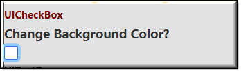
| Example: | "Change Background Color?" |
| tooltip: | Text put here will show up when the user moves or hovers the mouse pointer over a trigger area. |
| Example: | "Check box to change the Background Color." |
| fontSize: | Font size to appear in the User Interface. |
| Example: | "125%" |
Mixins
UITitleMixin
UIInputMixin
UIControlMixin
UIStyleMixin
BaseNode
BaseModel
RULE NAME |
TYPE |
DEFAULTS |
CATEGORY |
FLAGS |
|---|---|---|---|---|
bindParent |
any |
undefined |
UI |
Cached |
bindTarget |
string |
“” |
UI |
Cached |
sequenceNo |
number |
“” |
UI |
Cached |
title |
string |
“” |
UI |
Cached |
tooltip |
string |
“” |
UI |
Cached
|
fontSize |
string |
"normal" |
UI |
Cached |

Project Example:
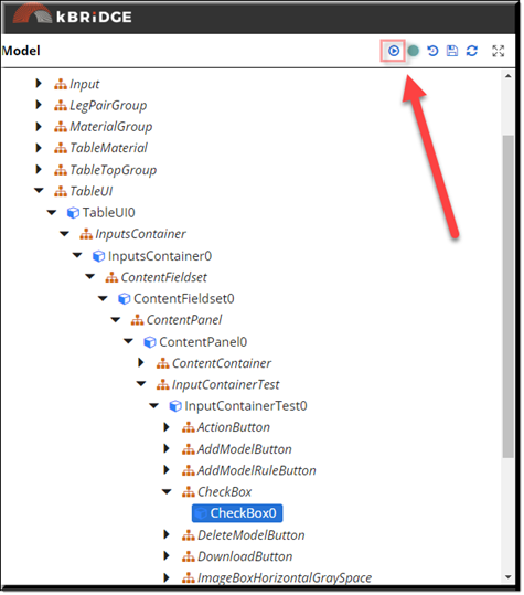
In your kBridge Examples Projects folder open the project called ‘MyTable’.
Reference Location:
“world.mytable.tableui.tableui0.inputscontainer.inputscontainer0.contentfieldset.contentfieldset0.contentpanel.contentpanel0.inputcontainertest.inputcontainertest0.checkbox.checkbox0”
Link: https://knowledgebridge.engineer/projects
Open the MyTable project.
Press the UI start icon to start the User Interface.
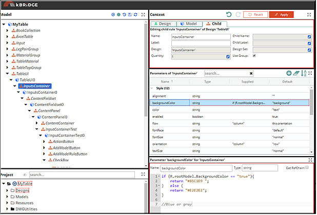
A rule was created in the root (MyTable) called BackGroundColor which is a boolean type with a default of ‘false’. When the check box is selected in the UI it sets the ‘BackGroundColor’ to ‘true’.
Then in the InputsContainer/backgroundColor this value was inserted:
| if (R.rootModel.BackgroundColor === true){ |
| return "#85C1E9 "; |
| } else { |
| return "#E2E2E2"; |
| } |
| //Blue or gray |
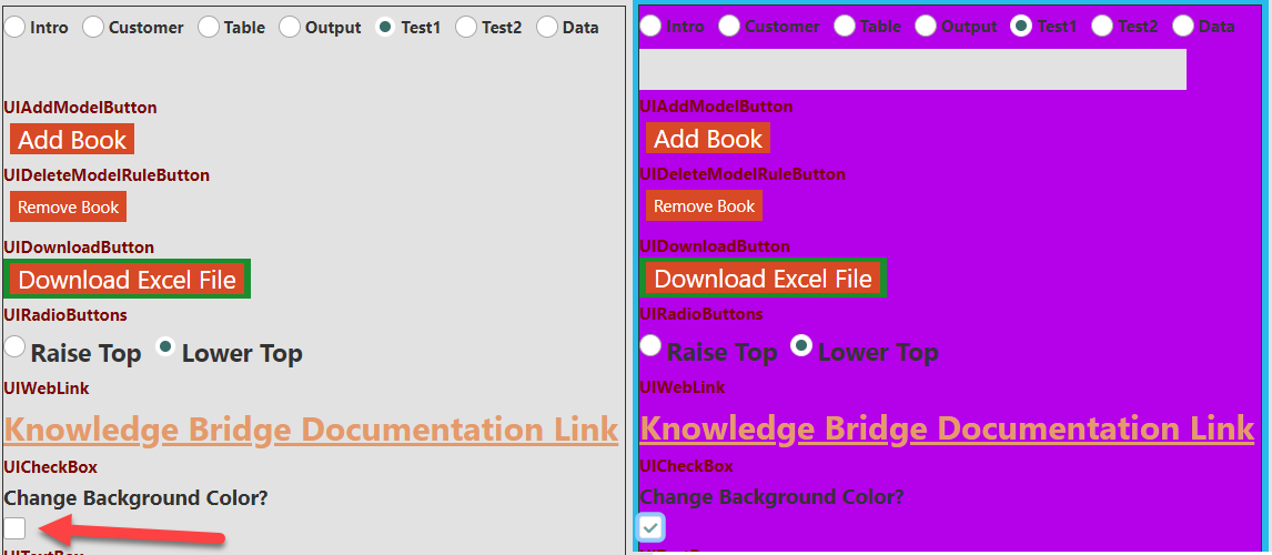
Select 'Test1' from the UIRadioButton.
The image below shows the UICheckBox Unselected and Selected.