EXERCISE: CUSTOM UI
LAYOUT EXAMPLE
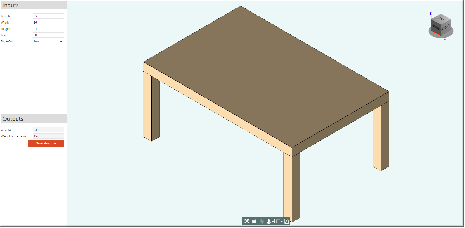
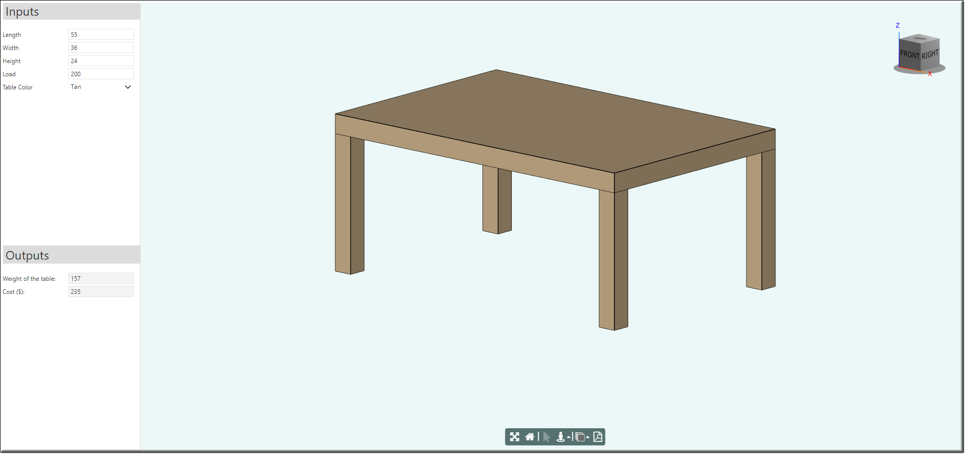
We are going to build the following custom UI for the Table project. It provides an end-user with an easy to configure key attributes of the table including its size and color.
EXERCISE: CUSTOM UI
CUSTOM UI DESIGNS
Create the following designs with corresponding mixins:
•TableUI (add UIContainer design as a mixin)
•LeftContainer (add UIContainer design as a mixin)
•TopPanel, BottomPanel (add UIPanel design as a mixin)
•InputSet, OutputSet (add UIFieldSet design as a mixin)
EXERCISE: CUSTOM UI
TREE STRUCTURE
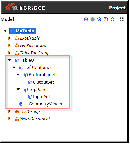
Build the following tree structure from the designs created for custom UI layout.
Drag and drop a UIGeometryViewer design to the TableUI node.
EXERCISE: CUSTOM UI
PARAMETERS FOR THE CHILD RULES
Supply the values to the following:
TableUI:
height: “fill”
width: “fill”
UIGeometryViewer:
height: “full”
width: “fill”
sequenceNo: 1
TopPanel:
header: “Inputs”
height: “fill”
border: true
borderColor: “Gainsboro”
LeftContainer:
flow: “column”
height: “full”
BottomPanel:
header: “Outputs”
height: “fill”
border: true
borderColor: “Gainsboro”
sequenceNo: 1
OutputSet:
orientation: “vertical”
width: “full”
itemTitleLocation: “left”
InputSet:
orientation: “vertical”
itemTitleLocation: “left”
EXERCISE: CUSTOM UI
LAYOUT EXAMPLE
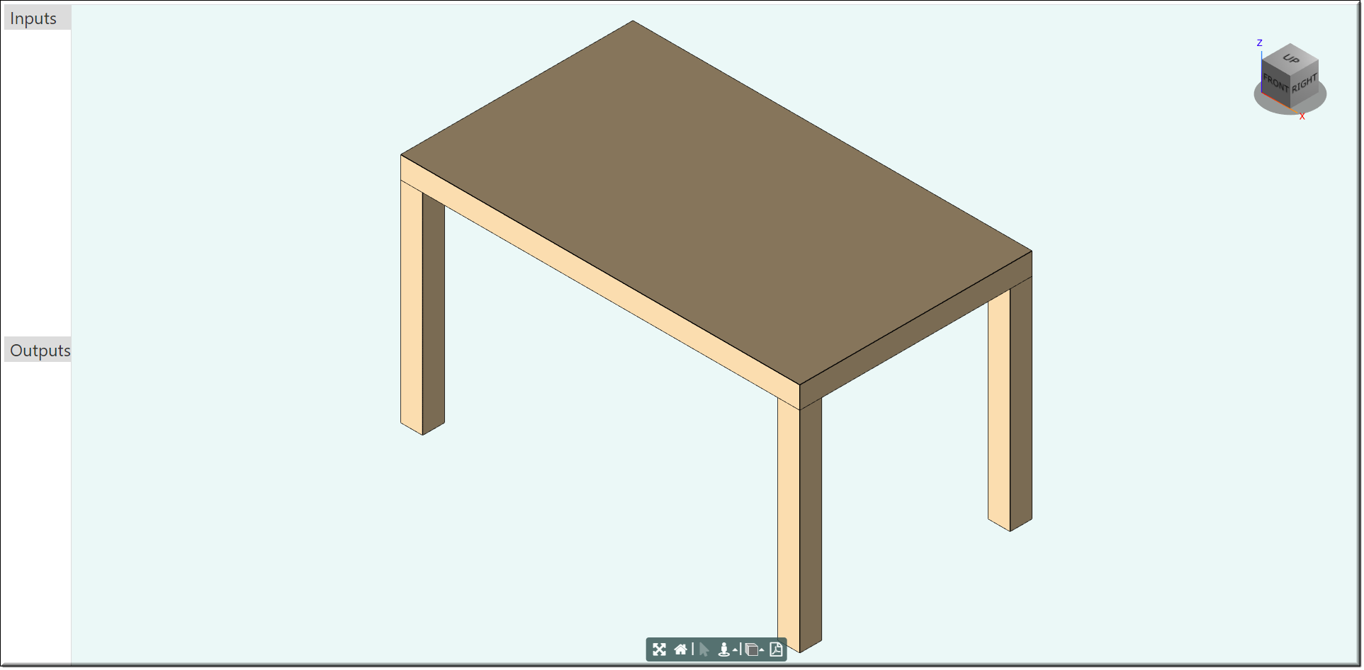
Run project to check custom UI layout:

EXERCISE: CUSTOM UI
CONTROLS FOR THE INPUTS
Create new rule tableRef of model type in the InputSet design with cached and parameter flags. Set Category to UI.
Supply the value to tableRef parameter as R.rootModel
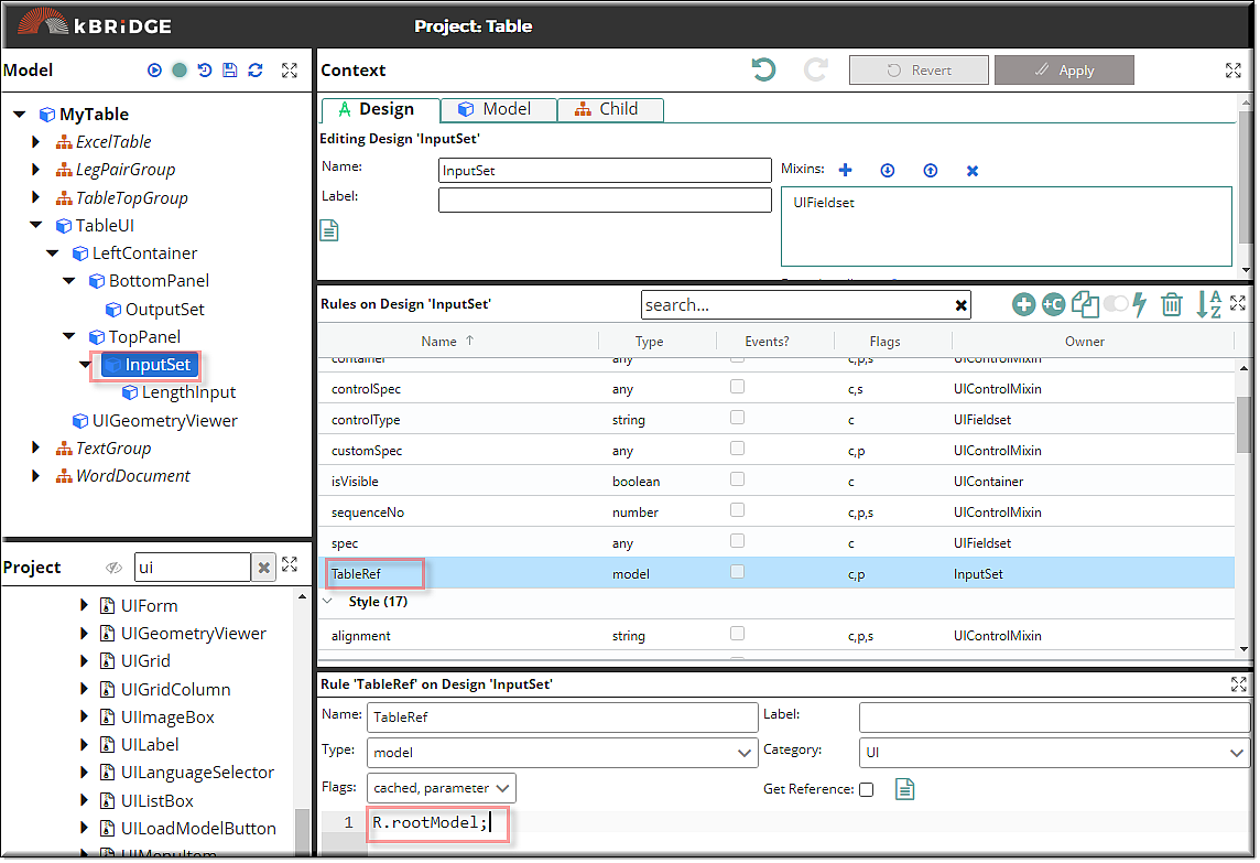
Add a child to the InputSet0 using UINumericInput design, rename it to the LengthInput and supply the following values to the parameters bindParent, bindTarget and title.
LengthInput
•bindParent: this.TableRef
•bindTarget: 'length'
•title: 'Length'
•sequenceNo: 1
In the same way add other children to the InputSet0 using UINumericInput design for WidthInput, HeightInput and LoadInput.
Use sequenceNo rule to define the order of the controls in the UI.
WidthInput
•bindParent: this.TableRef
•bindTarget: 'width'
•title: 'Width'
•sequenceNo: 2
HeightInput
•bindParent: this.TableRef
•bindTarget: 'height'
•title: 'Height'
•sequenceNo: 3
LoadInput
•bindParent: this.TableRef
•bindTarget: 'load'
•title: 'Load'
•sequenceNo: 4
Add another child to the InputSet using UIDropdown design, rename it to ColorDropDown and supply the following values to the parameters.
•bindParent: this.TableRef
•choices: ["Red", "Yellow", "Blue"]
•bindTarget: 'color'
•title: 'Table Color'
•toolTip: 'Choose the table color.'
Run project to check custom UI layout:

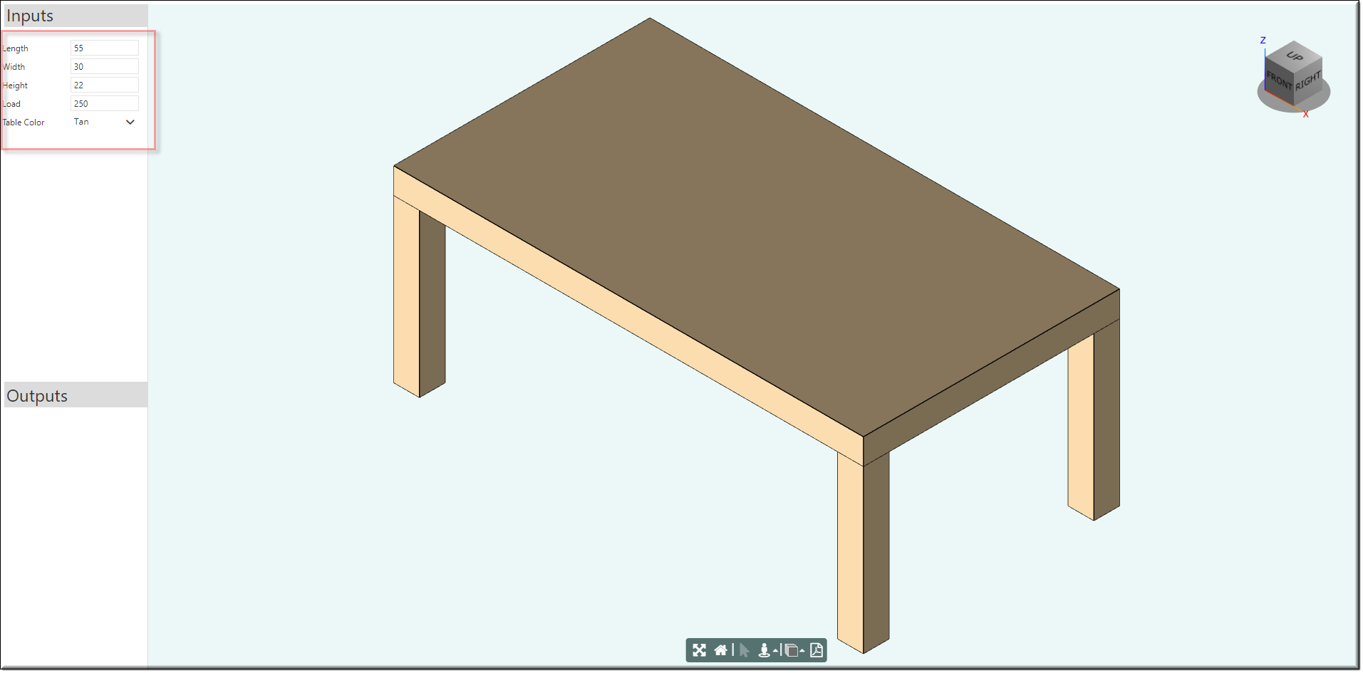
Your Inputs column should look like this:
EXERCISE: CUSTOM UI
CONTROLS FOR THE OUTPUTS
For the OutputSet add children using UITextInput design to display Cost and Weight. Supply the following values to the parameters.
Cost:
bindParent: R.rootModel
bindTarget: “cost”
title: “Cost ($): ”
sequenceNo: 1
enabled: false
Weight:
bindParent: R.rootModel
bindTarget: “weight”
title: “Weight (kg)”
enabled: false
tooltip: “Weight of the table: ”
EXERCISE: CUSTOM UI
CONTROLS FOR THE OUTPUTS
Add child to the OutputSet using UIDownloadButton design, name it Download. Supply the following values to the parameters.
UIDownloadButton :
fileExpression: “R.rootModel.WordDocument.WordDocument0.outputUrl”
caption: “Generate quote”
sequenceNo: 3
EXERCISE: CUSTOM UI
LAYOUT EXAMPLE
Finally you should get the following custom UI layout.
