Custom UI
Custom UI in kBridge
Custom UI development provides an interactive and usually graphical interface to the end user. One primary use is to provide a way for non-technical personnel to enter information destined to drive new product configurations, or technical personnel to create output from automated engineering routines. As a result, personnel in sales, business processes, and other company departments can dramatically speed up engineered-to-order products—and engineers can offload repetitive and/or complex calculations and design activities, giving them more time to devote to high value-added product development functions.
The kBridge custom UI is controls-driven where you, the developer, can set up arrays of on-screen choices, graphical representations, and rules-driven outputs to make an end-user's job easier.
There are two major types of controls presented in the UI library:
•Container controls—controls that can contain other controls to organize them in the hierarchy of UI objects.
•Regular (non-container) controls—controls that normally present data on the screen.
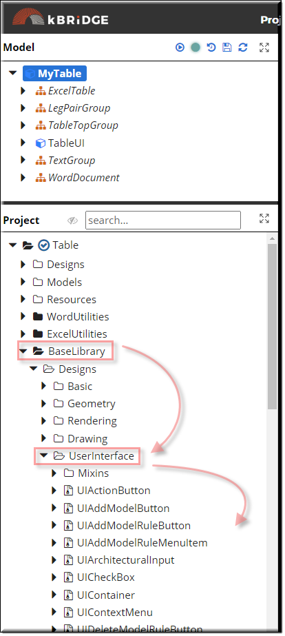
The UI controls or designs can be found in the BaseLibrary/UserInterface folder.

Container Controls
Control types
The following controls belong to the container type:
•UIContainer - basic container control that organizes screen space into smaller areas. This control has no graphical presentation on the screen, but it helps organizing other controls responsively, that is, by reacting to browser resizing and repositioning the controls placed into it.
•UIPanel - container control that organizes other controls (most often it is field sets) into panel-style UI. This control may have a border and a header
•UIFieldset - container control that helps the rules author to build nice, well aligned sets of input controls
Regular controls
Control types
The following controls belong to the regular type:
Inputs
•UICheckBox
•UIDropdown
•UIListBox
•UIMultilineText
•UINumericInput
•UIRadioButtons
•UITextBox
•UITextInput
•UIArchitecturalInput
Complex data editor
•UITable
•UITableColumn
Context menu
•UIContextMenu
•UIAddModelRuleMenuItem
•UIDeleteModelRuleMenuItem
•UIMenuItemSeparator
Buttons
•UIAddModelButton
•UIAddModelRuleButton
•UIDeleteModelButton
•UIDownloadButton
Others
•UIGeometryViewer
•UIImageBox
•UITheme
•UILabel
Container
organizing screen space
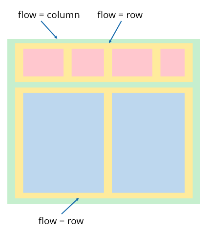
In the diagram below, yellow containers must be populated with children.
The order of the child controls matters as each control has a sequenceNo parameter that is used to properly order the controls.
Default value is 0; all controls with the same sequenceNo may appear in random order, so rules authors should always set sequential numbers corresponding to the order in which controls must appear on the screen.

Controls
Control Sizes
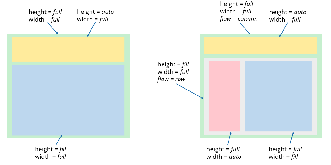
The size of the control is calculated based on a combination of parent size, the control’s own size, and children size (in case of containers).
The top level element (UI root) of the Custom UI hierarchy always occupies full height and width of the window.
Both height and width may have these values:
full - control will occupy whole available height or width respectively.
auto - control will be sized automatically based on its content (container) or using pre-defined size.
fill - control will fill in space in parent container that remains in row or column.
Controls
Control Sizes

Regular Controls
Positioning
In any given container, flow controls may take either start or end positions.
The start position locates the controls at the beginning of the flow (i.e. aligned at top if flow=column, or left if flow=row).
End position locates the controls at the end of the flow (i.e. aligned at bottom if flow=column, or right of flow=row).
Note that aligning controls at the end of a parent container requires that the parent container have a fixed size.
For example, width (for flow=row) or height (for flow=column) must be non-auto. In other words,
the container can be stretched by its parent, but not by its content.
Custom UI
Summary
Generally, there are two different behaviors of controls from auto-sizing perspective:
1.Containers - these controls normally have no size of their own and are stretched either to fill the parent’s space (if set to full or fill) or expanded by children (if set to auto).
2. Input controls - text boxes, radio buttons, etc. These controls (most often) have their own size when set to auto (most single-line inputs have fixed height to occupy same height when placed together).
However, the width of these controls may be set to fill or full, so they will follow the width of their parent.
Note: setting full or fill height for single-line controls is possible but makes no sense.